Lowe’s Tile Tools
March 2025
The Goal:
Improve the Marshalltown tile tool set bay experience by designing a single, highly effective beam sign that brings clarity to a dense, visually crowded space. Though limited in scope, the project required a thoughtful approach to hierarchy and messaging to ensure customers could quickly navigate and understand the assortment.
My Role:
Designer

Vendor Proposal
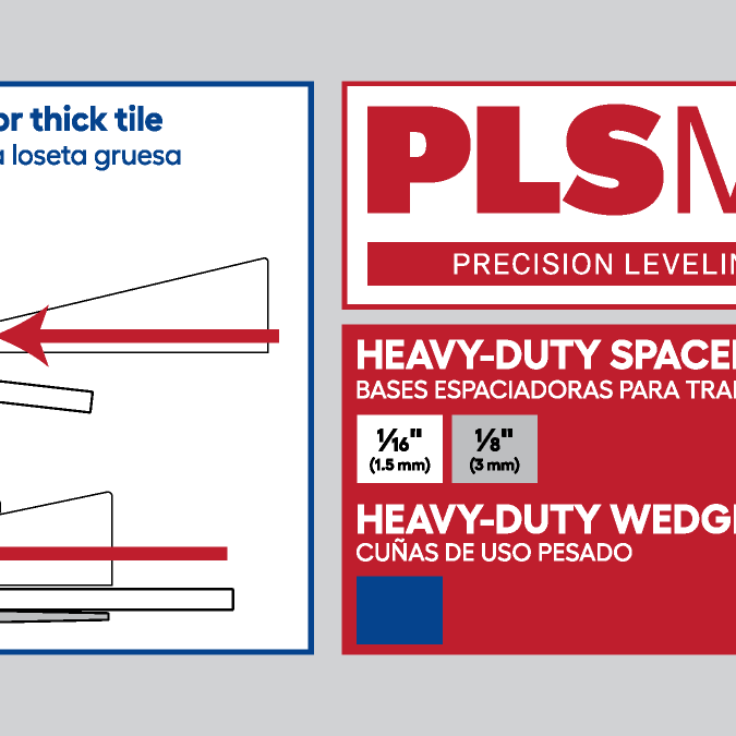
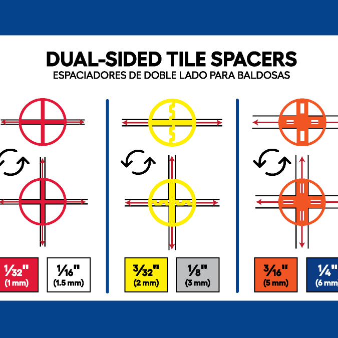
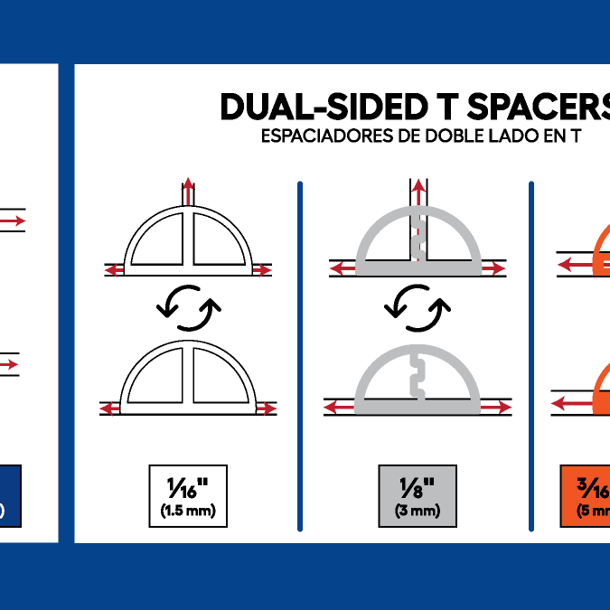
The proposed design lacks sufficient negative space and visual hierarchy, which compromises legibility. Additionally, the use of color coding and infographics is unclear, potentially leading to customer confusion. Finally, the overall design does not align with Lowe’s established brand standards.

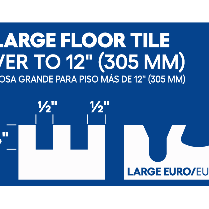
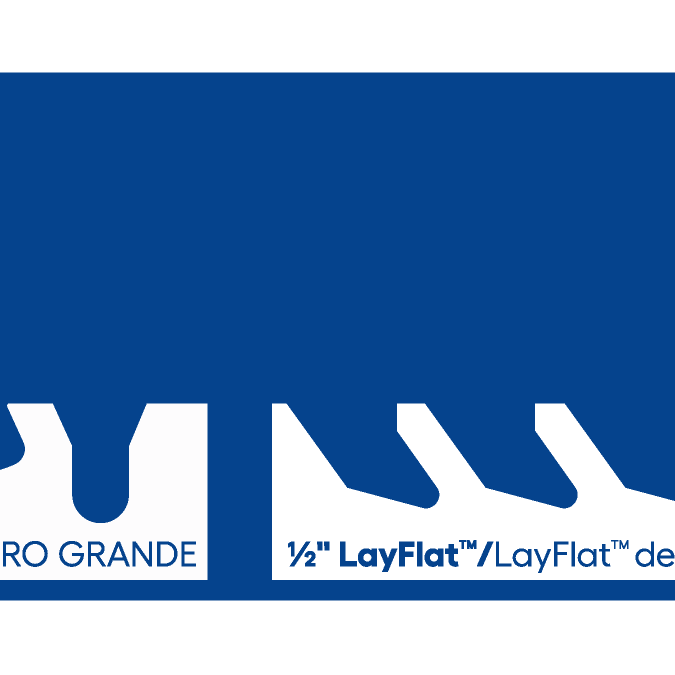
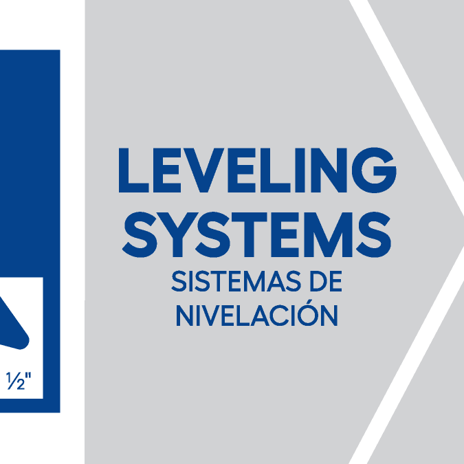
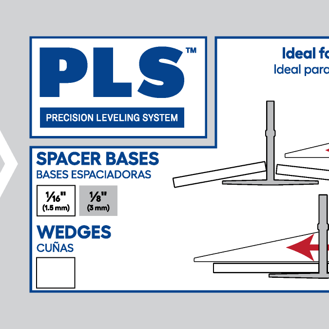
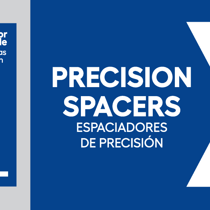
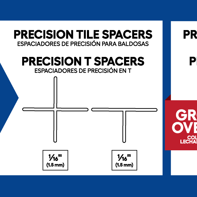
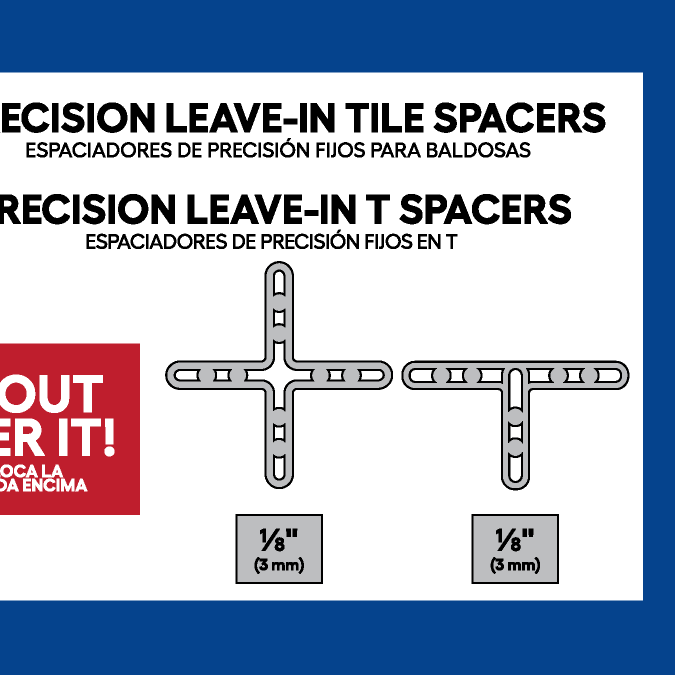
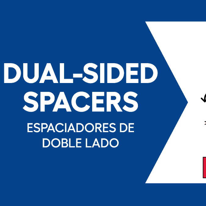
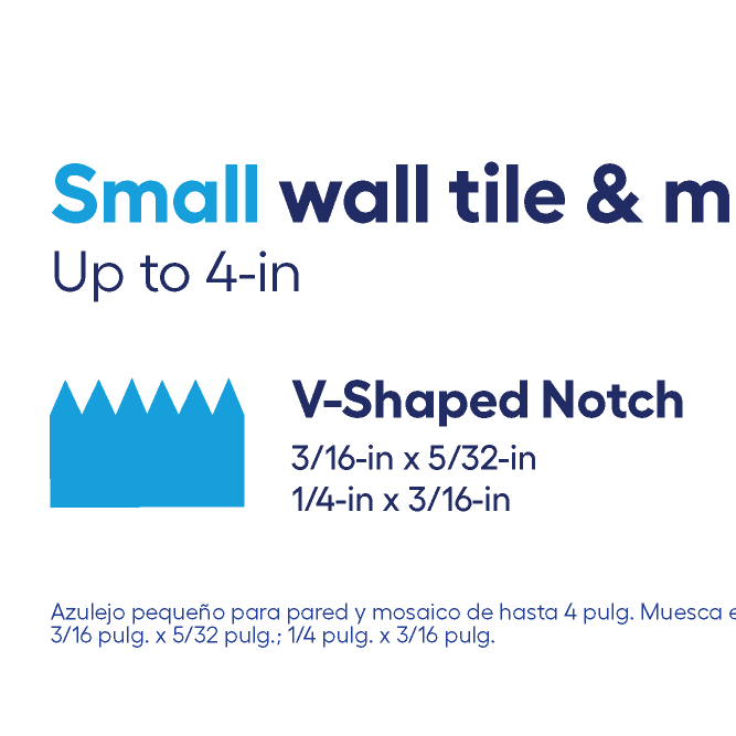
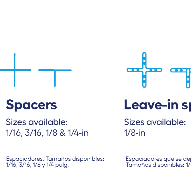
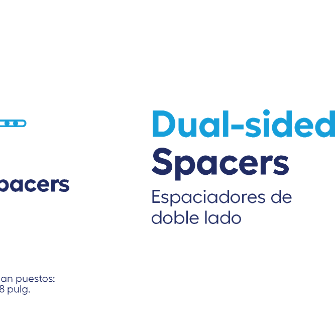
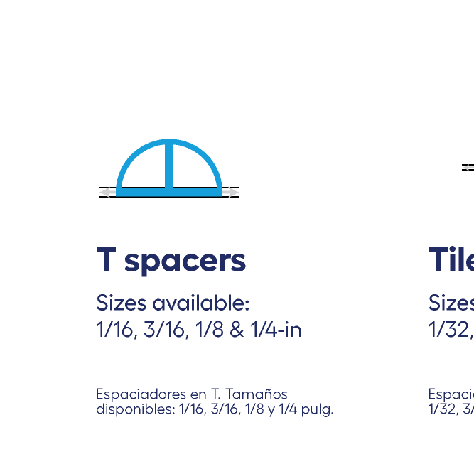
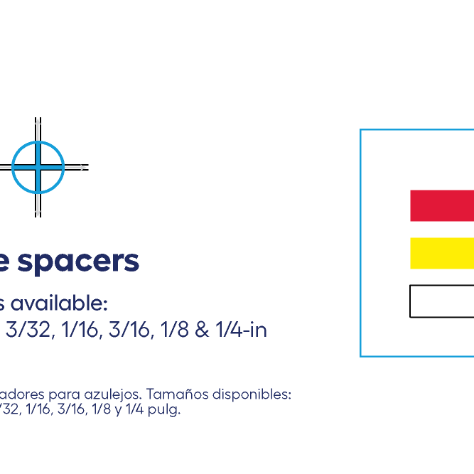
Solution
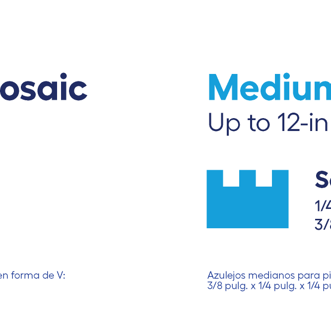
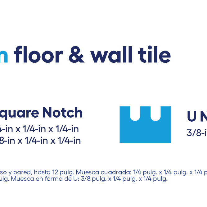
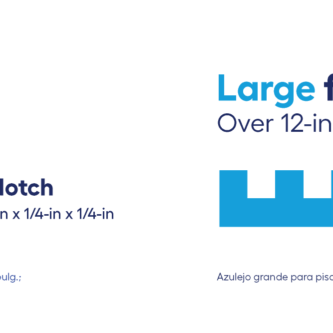
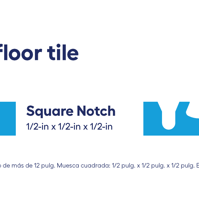
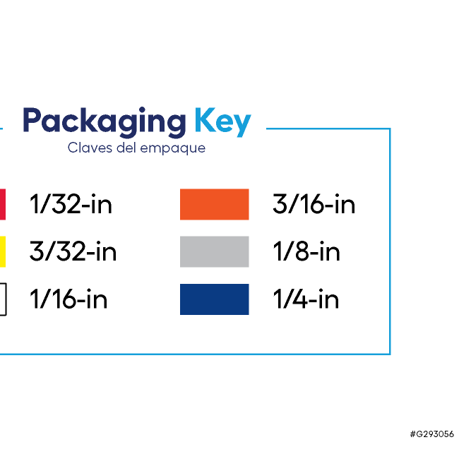
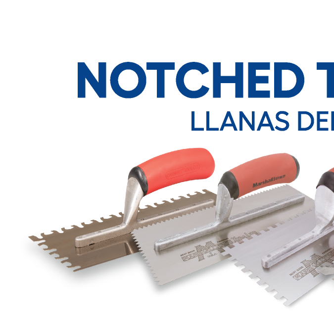
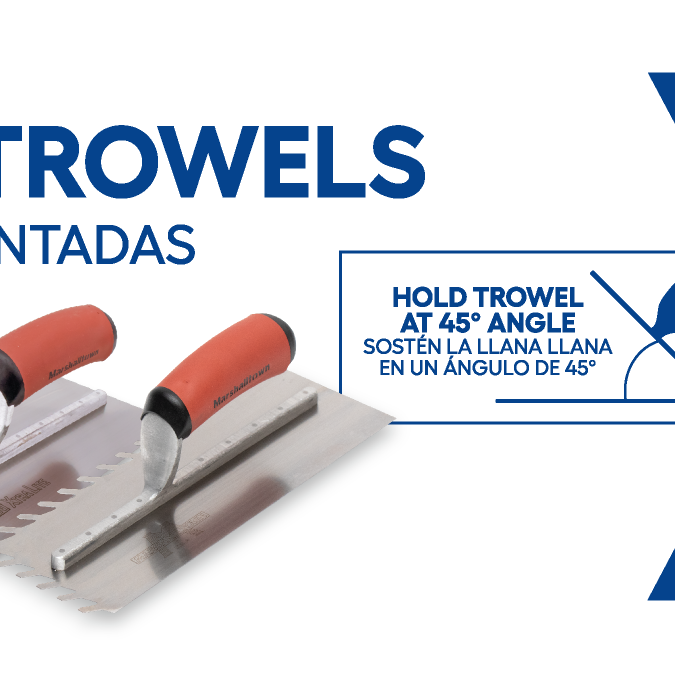
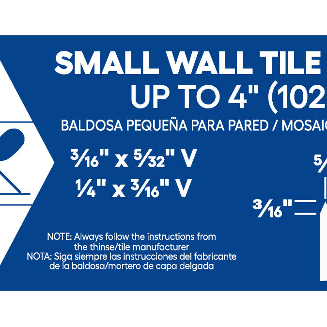
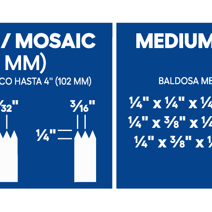
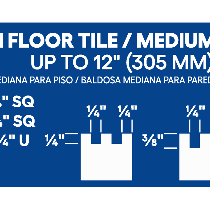
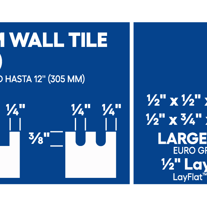
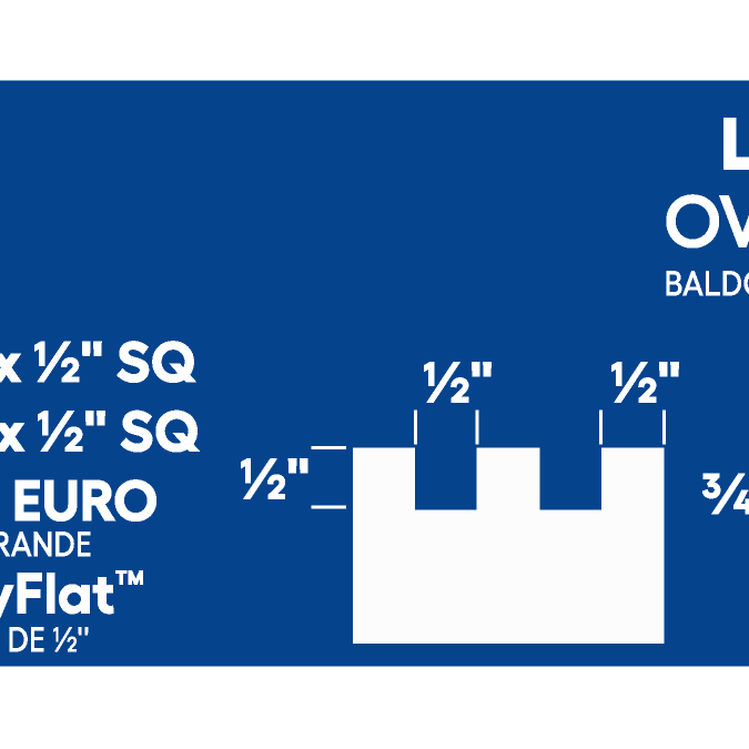
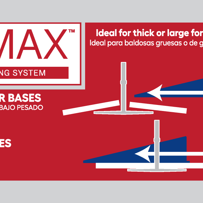
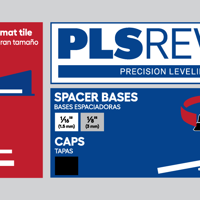
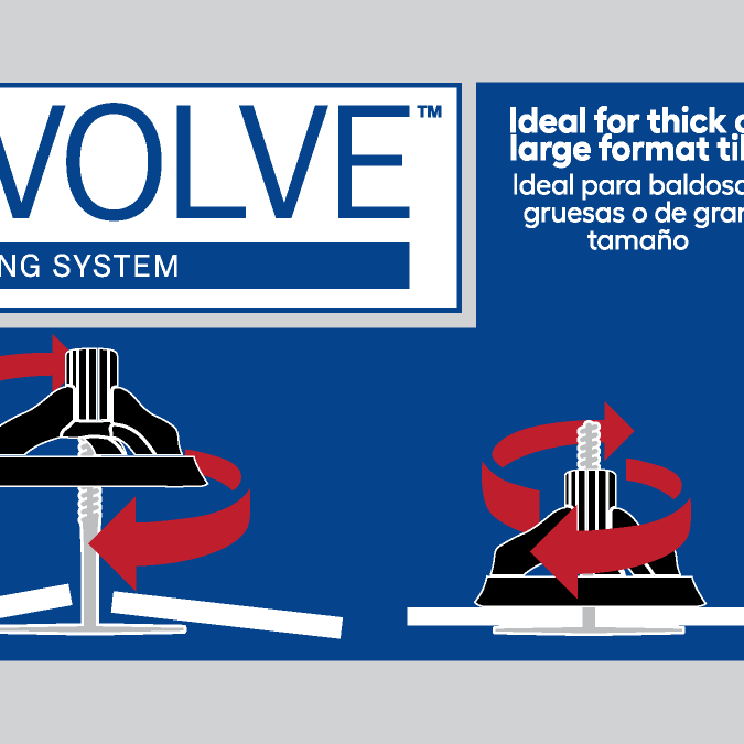
The revised design simplifies the overall content by reducing copy and streamlining the message. Enhanced typographic hierarchy improves readability and helps customers quickly identify key information. Color coding has been consolidated into a single, clearly labeled area to better support the shopping experience.